There’s a fairy tale in every Kilimnik
Karen Kilimnik’s painting skills were always good. But they have improved, and she looks set now for some kind of immortality. This is underlined by the lack of installation material in this show. Kilimnik shows have mostly been a mixture of stuff on the floor, scene-setting colours or motifs (lightning bolts etc.) painted on the walls, and her paintings, which were hung as if to fit the installation – which depicted a stage-set, an interior from a novel, or some such place glowing with the embers or promise of glamour. It was always a good question whether the paintings were made to fit the installations or vice-versa. The whole was always adroitly done, with minimal means, like the work of the best set-dressers, and the satisfying answer seemed to be that since all was one in Kilimnik’s head, and all fiction, and in thrall to all kinds of fiction both fictional and real (such as that of the British Royal family and other classy milieux) then the unity of installation and canvases was perfect.
I am a Kilimnik fan – even though some of the things that interest her aren’t my kind of thing – celebrities, the Royals, the aristocracy, and now, apparently (though I only realised this when I read the press release) the two world wars – which interest me very much, but which can be presented in ways that are irritating. In Britain we have almost nightly television programmes about the world wars. Some are good. (I have yet to see one on the bombing of Nijmegen.) But poppies are everywhere, you could say. War memorials are springing up all over the country. 70,000 pounds were spent recently on a new memorial in a Midlands village; this is a personal story – I know someone who lives there. She is 72. She thinks the money should have been spent on something else. Does Kilimnik think about such things? Probably she does. She told me she would vote Green if there was a candidate, otherwise it’ll be Bernie Sanders. I admit I was happy to hear this – from her work you might be forgiven for thinking some of her interests verge on the unhealthy. But then, what really is the subject of her work? She deals with images and stories. She might be political, but her work is about the imagination and other people’s versions of history. It’s the same with her interest in nature – and an essay on her as a nature artist would be interesting (if there isn’t one already.) She’s a green, but in her work it’s others’ interpretations of nature that interest her. I like this about her. It gives her freedom, and access. And I ought to say: having an interest in British painting of the 17th to 19th centuries does involve looking at a lot of pictures of the upper classes, many of which represent the best in British art.
I don’t know if the two paintings of Leonardo da Vinci’s last home really depict that place. They might show a converted farmhouse in Suffolk for all I know. They look copied from a museum postcard. Both show the same view of the same living room. One has the addition of a unicorn, facing, across the room, a walled-up door, white like him, suggesting he might be about to charge through it into another world. This is a My Little Pony unicorn, white with pink highlights, and flatly painted like a Baldessari dot, although he does have a shadow. There is a matching bunch of white flowers, in a black vase.
And Kilimnik has become a flower photographer, I see. The blue poppies and white and pink roses shown here – I read – are being seen through binoculars, hence the dark arches at the top of each of the two photos. They therefore represent war, despite their colours, unless the blue of these Himalayan poppies, along with the white and pink, is intended to represent France. I am not terribly convinced by this reading, even if the title seems to confirm it: Fairies in the Farm Field, France, 1915. Even if it’s Kilimnik’s own, then. The dark arches might just as easily be there to suggest an enclosed space, a fairy’s view of life, his or her home. True, the compositions make them look like groups of figures, stretching beyond the frame, left and right. So, frieze, crowd, or field. They’re memorable and alive. The fairies of the title may represent art’s ability to bring matter to life, to make plants animate, and the animate human. Nevertheless there are no fairies in either photo.
All the paintings here are in inverted commas, so to speak. At the same time they are sincere. This ability to cite, or copy, to have some kind of irony, but to make a sincere painting, is Kilimnik. In her installations she sets up, or at least implies, a house, a theatre, etc., but also makes an exhibition, just as she copies a Chardin but also paints her own painting. ‘Using quotations, borrowings, parodies, and copies is…a sign of vitality’, says one Jacqueline Lichtenstein, writing about Valerie Favre in particular, but the contemporary painter in general. Kilimnik’s sources are artists who depict social worlds – including the photographers of models, pop stars etc., right down to Chardin. She turns galleries into other kinds of social space. The way a theatre is divided – indeed the way every social space is divided – is worth bearing in mind when looking at her paintings.
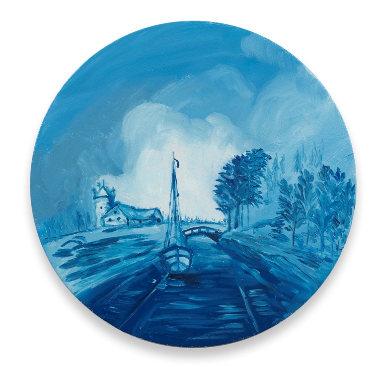
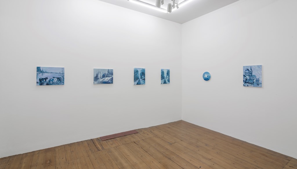
There are eight pictures based on Delftware plates. The idea of returning the blue and white pictures on the plates to oil on canvas works well – ‘conceptually’, if you like. Some of the original pictures really were taken from oil paintings, others tried to look as if they were. Kilimnik keeps the blue and white. If you are copying a picture that pretends to be a copy of something else (something further up the social ladder) then you are entering a hall of mirrors. Delftware summons the Dutch Golden Age, an era when the middle classes came into their own, along with an idea of the home, the home as the shell of the individual, of the autonomous self and the nuclear family. The idea of home is everywhere in Kilimnik’s work: maybe the lost original home of Europe, maybe Europe as it exists in America. The fairies, the quaint houses in the woods, the living rooms, the old Dutch streets and lanes, fit somehow with the Barbie dolls she once used in an installation, even if they were the Barbie dolls of a horror movie – a horror movie of the disturbed home variety.
A painter friend of mine says of the show that she likes the Delftware paintings best ‘because they are quicker’. Yes, Kilimnik’s ‘quickness’, illusory or not, is an asset, the surfaces never look overworked. But some of the canvases here were prepared with six coats of gesso. That means allowing each coat to dry, sanding it, starting again. It took the technicians a long time. And it says something about what goes on top.
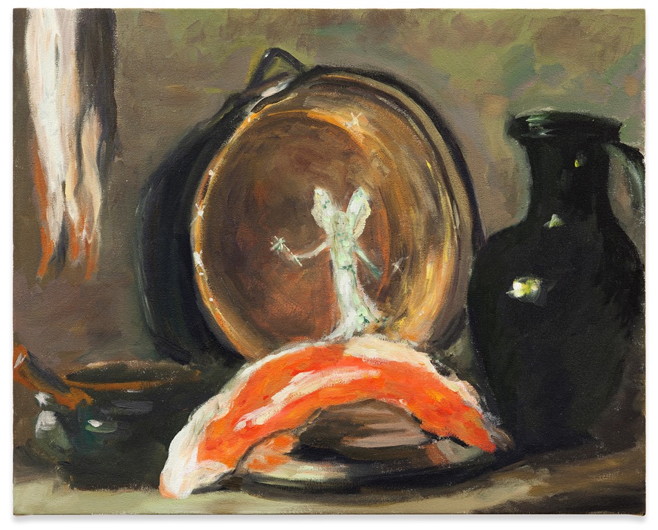
To copy Chardin may seem foolish. To do it with bold strokes is probably best. Kilimnik’s bravura version might make you smile. It’s well painted in a way alien to Chardin. To add a smiling fairy looks even more foolish, or like genius. The fairy, the title tells us, is the fairy of Fairy Liquid, the washing-up product. But what we take away is that she is Chardin’s genius, his muse. She’s the power of art, and now I look again, she’s not unlike the Winged Victory, of whom more in a minute. The Nike doing Chardin’s dishes. That’s definitely Kilimnik. And the idea of Chardin as a painter of washing-up is funny and astute.
Kilimnik’s work might be better understood if we cast it in the light of the debate about originality, copies, etc. which blew up in the 18th century (one of her favourite centuries) when the ruins of Greece and Rome began to be dug up and looked at in earnest and distinguished one from the other. Recently there has been much written on the subject of ruins, and a number of exhibitions, including, in London, Ruin Lust of 2013.
Antoine C. Quatremère de Quincy’s 1820 account of the discovery of the Venus de Milo tells of finding the ruins of a theatre, and nearby, in an underground chamber, the Venus. ‘The question of originality (taking the word in an absolute sense) will probably long and perhaps forever remain unresolved with regard to the most beautiful art antiques,’ de Quincy writes. The copying began in classical Greece. De Quincy and his ilk were looking for a kind of purity in their search for the originals of the sculptures. Somewhat hopelessly, as he admits. The quality of the work is the best indication, he says. This text would fascinate Kilimnik, if she doesn’t know it already. Asked once in interview which one artwork she would like to own, she replied the Winged Victory of Samothrace.
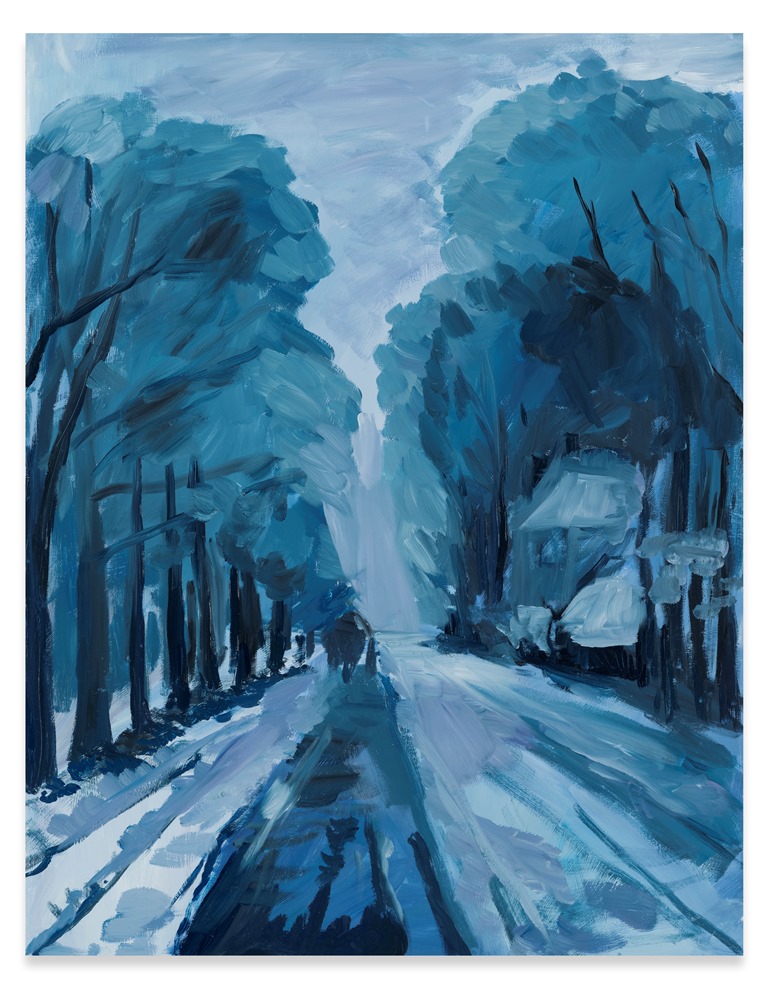
Then there are two paintings that remind me of Charles Burchfield. They have anthropomorphised or at least animalised trees, with overactive roots. I googled Utrillo and Burchfield, out of interest, pasting images next to Kilimniks. Utrillo in this context looks crystalline, Burchfield visionary and – as he intended – full of sound. No surprises there. But what became clear is how animated, how animal Kilimnik’s nature looks. She can paint wildness. The quaint title of ‘the green fairy’s cottage in the tapestry’, the glitter, the two fairies and the general cuteness, are decoys. She can do wild with the best of them.
Saami medieval royal castle 12th century, is iconologically very bizarre, since the Saami or Sami are the Lapps or Laplanders, and the idea of them having a medieval castle is a fairy story of a very strange order. Especially one under a British coat of arms. I suspect Kilimnik may have found (or imagined) some Lapp blood in her veins. So this flag is Kilimnikland’s. The Lapps have had to deal with Norway, Sweden, Finland and Russia, but not – as far as I know – with the British Empire (which wasn’t Medieval, by the way. And by the way again, maybe the unicorn that strayed into Leonardo’s living room came from these arms too?) What kind of a fiction is this? It’s a mix-up of history bordering on sci-fi, and slightly disturbing.
Does Kilimnik know what she is playing with, shuffling these politically loaded cards? Will she one day do something truly awful? I doubt it. She has proved herself endlessly conceptually shrewd. As it is, this essentially innocent painting succeeds in singing, and in making us think about the Lapps, national identity, political power. Maybe Kilimnik is mocking her own idea that the European psyche can be represented by painting all the castles that stretch from Ireland to Russia. I have no idea. ‘There’s a fairy tale in every Kilimnik,’ as my painter friend says.
Karen Kilimnik
Sprüth Magers
7A Grafton St., London
20.5 – 20.6.2015
David Lillington